Brief
To rebrand are well known company based in United Kingdom.
As the brief was broad, I decided to refine my remit. I looked for an iconic company involved in retail that could be modernised. It would be in tune with today’s society in relation to diversity and disability. I picked Hamleys because when I was a child, I remember the excitement of visiting the London store and I wanted to express that childlike excitement in the marketing. Hamleys is a very British brand that has expanded to be recognised worldwide in multiple cultures. I wanted to see if I could make the branding reflect that international presence.
Areas of branding that I wished to review
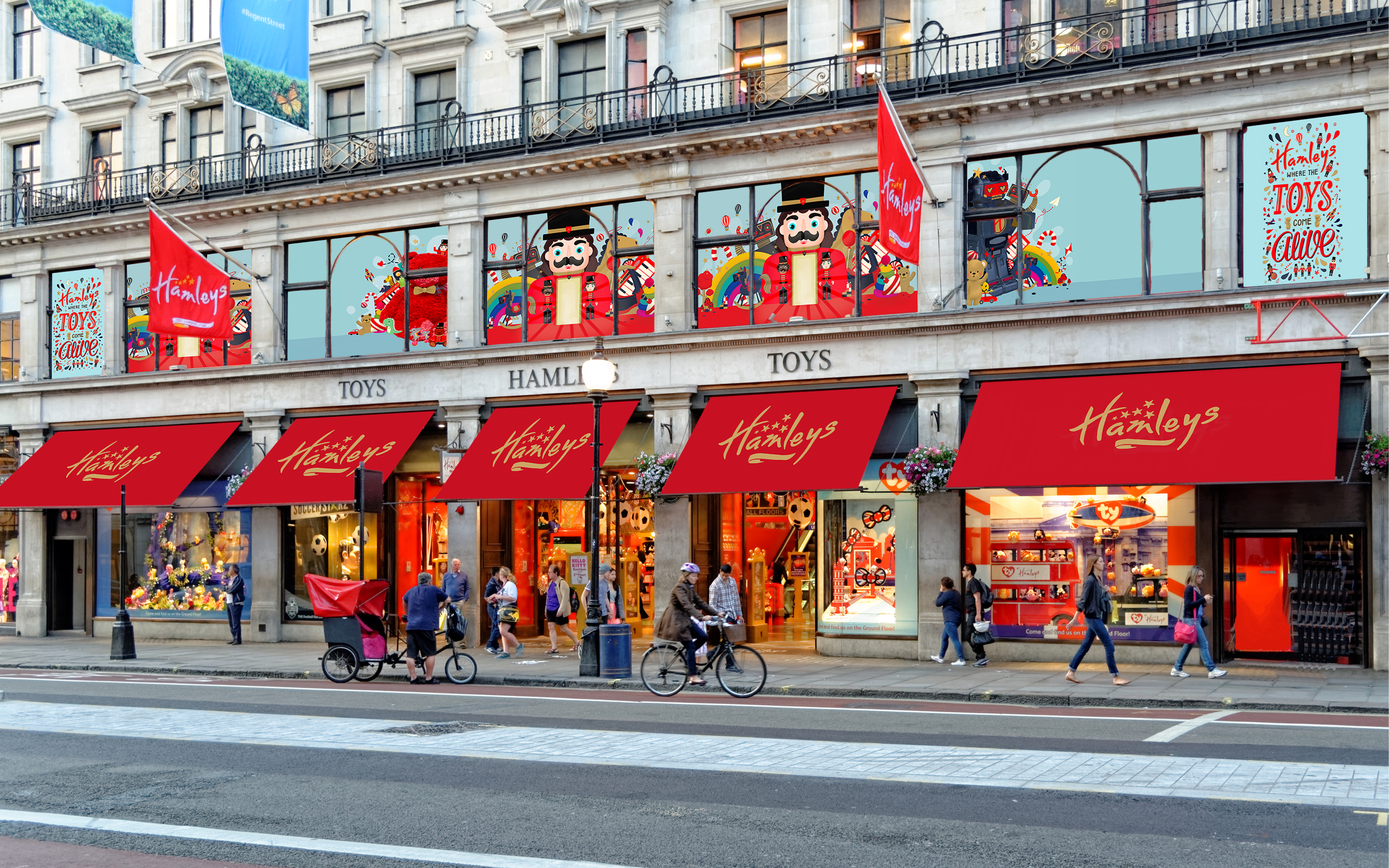
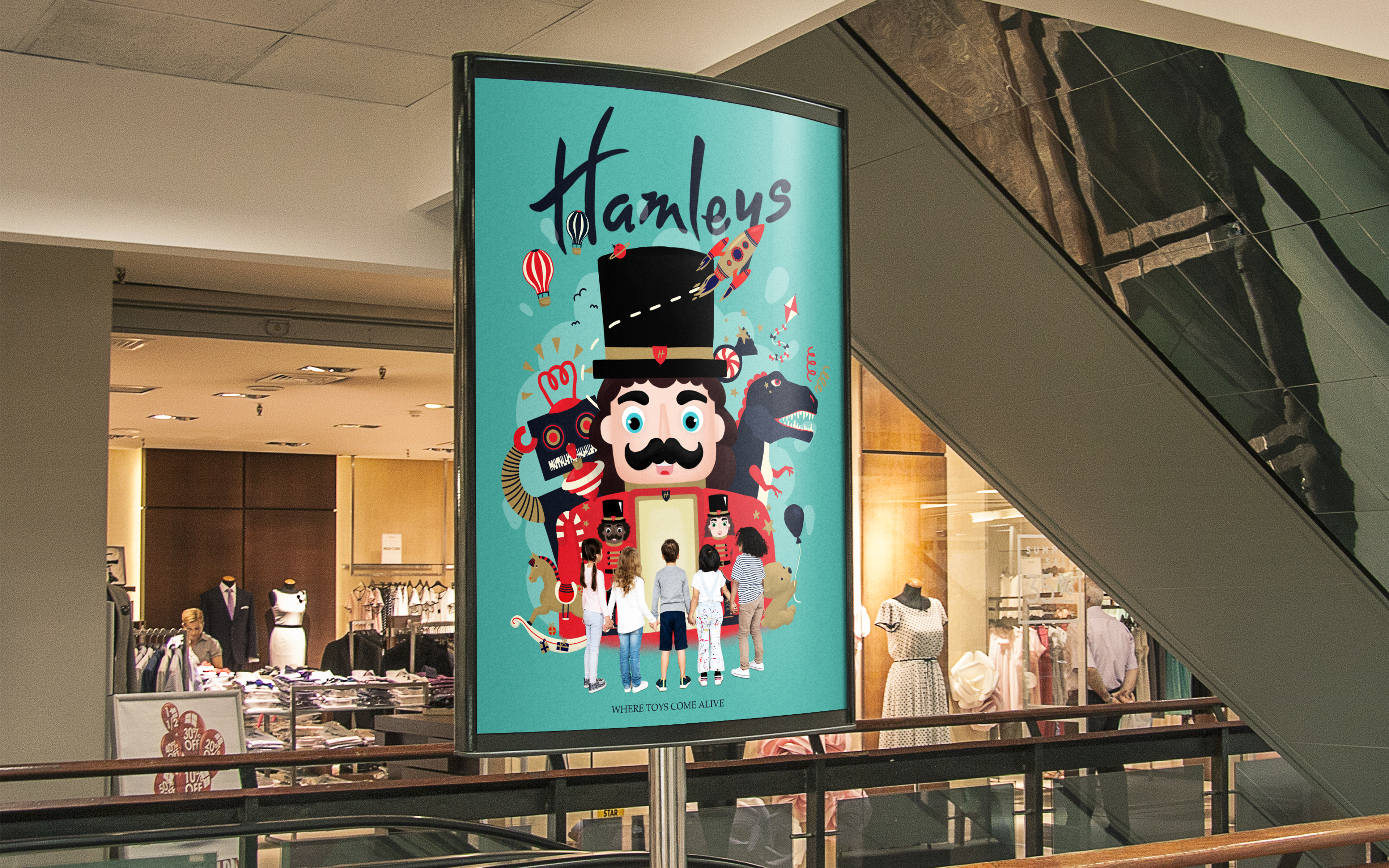
Mr Hamley, the main image used has remained unchanged for many years and I felt it was due an update. I wanted to expand the singular Mr Hamley to a family that would embrace multiple cultures' gender differences and disabilities.
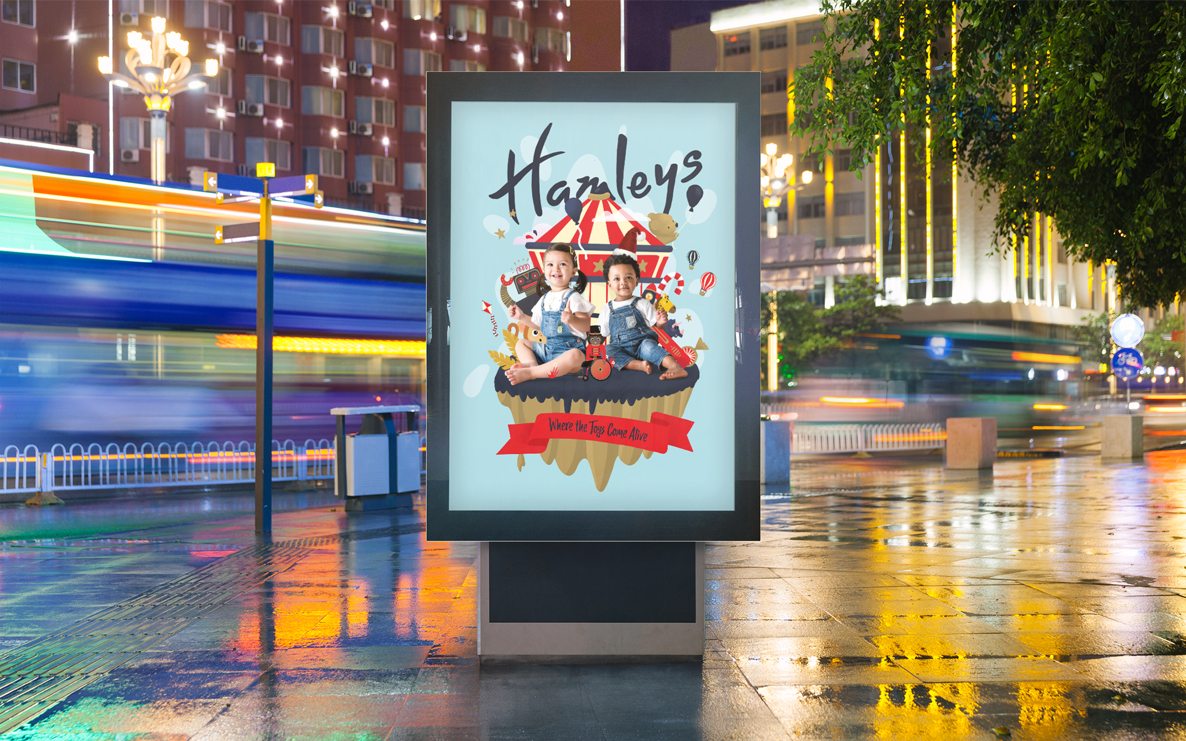
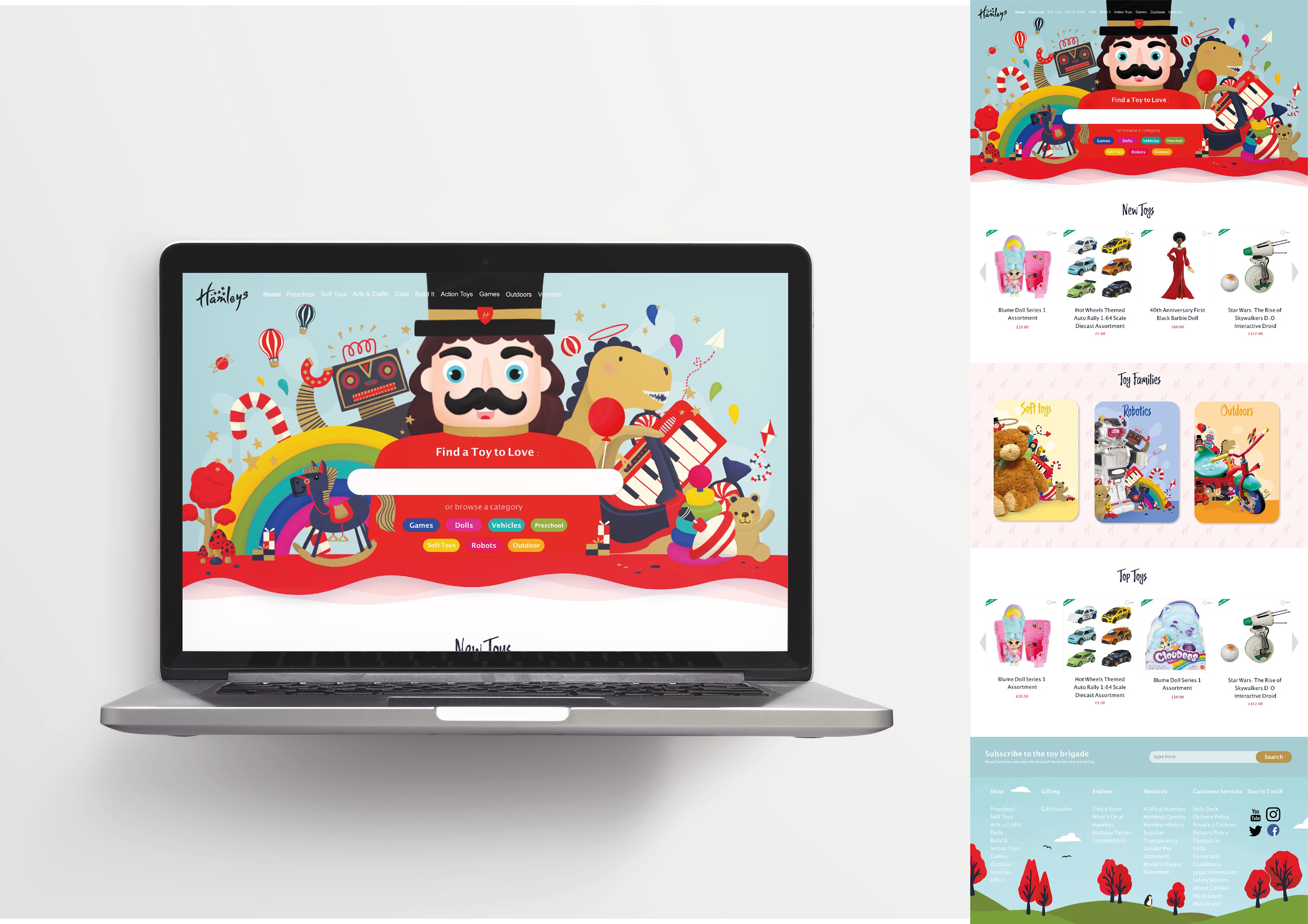
As this was a children’s brand, I felt it should reflect the life and fun we got through play so I wanted to depict some of the toys that are sold in the store. I felt the website should include modern elements that would be fun and appeal to the audience both children and relatives.
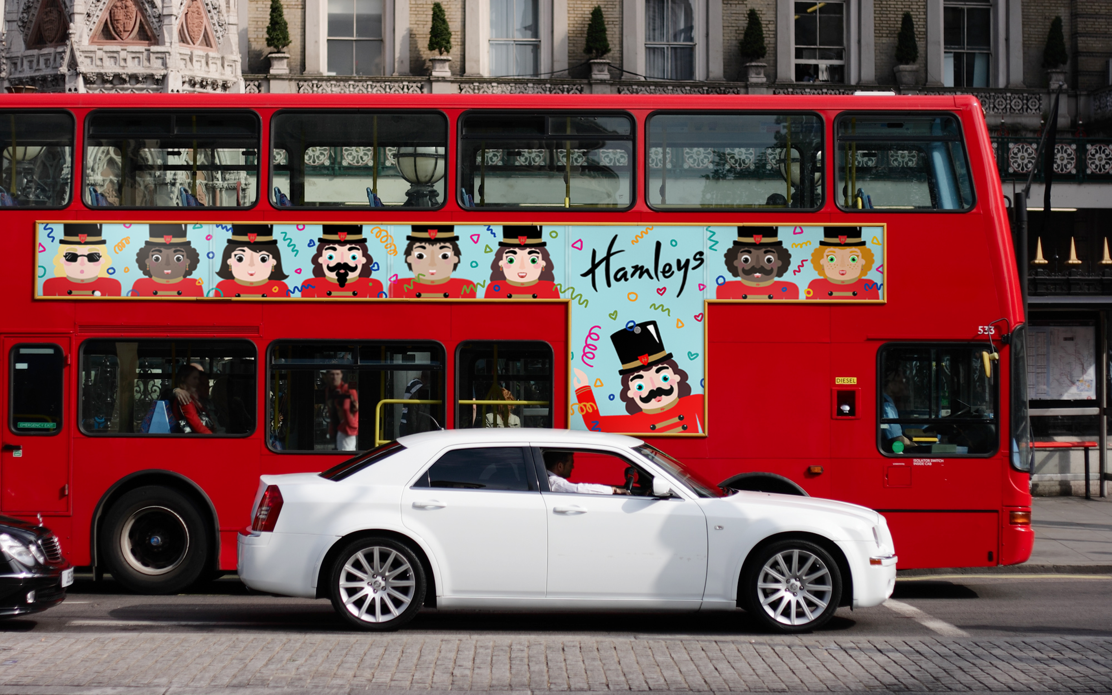
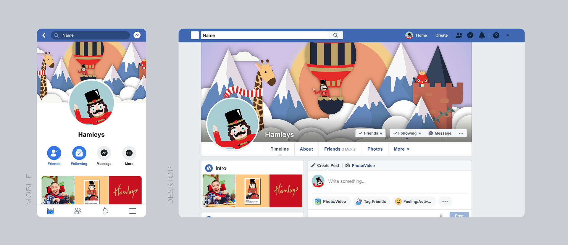
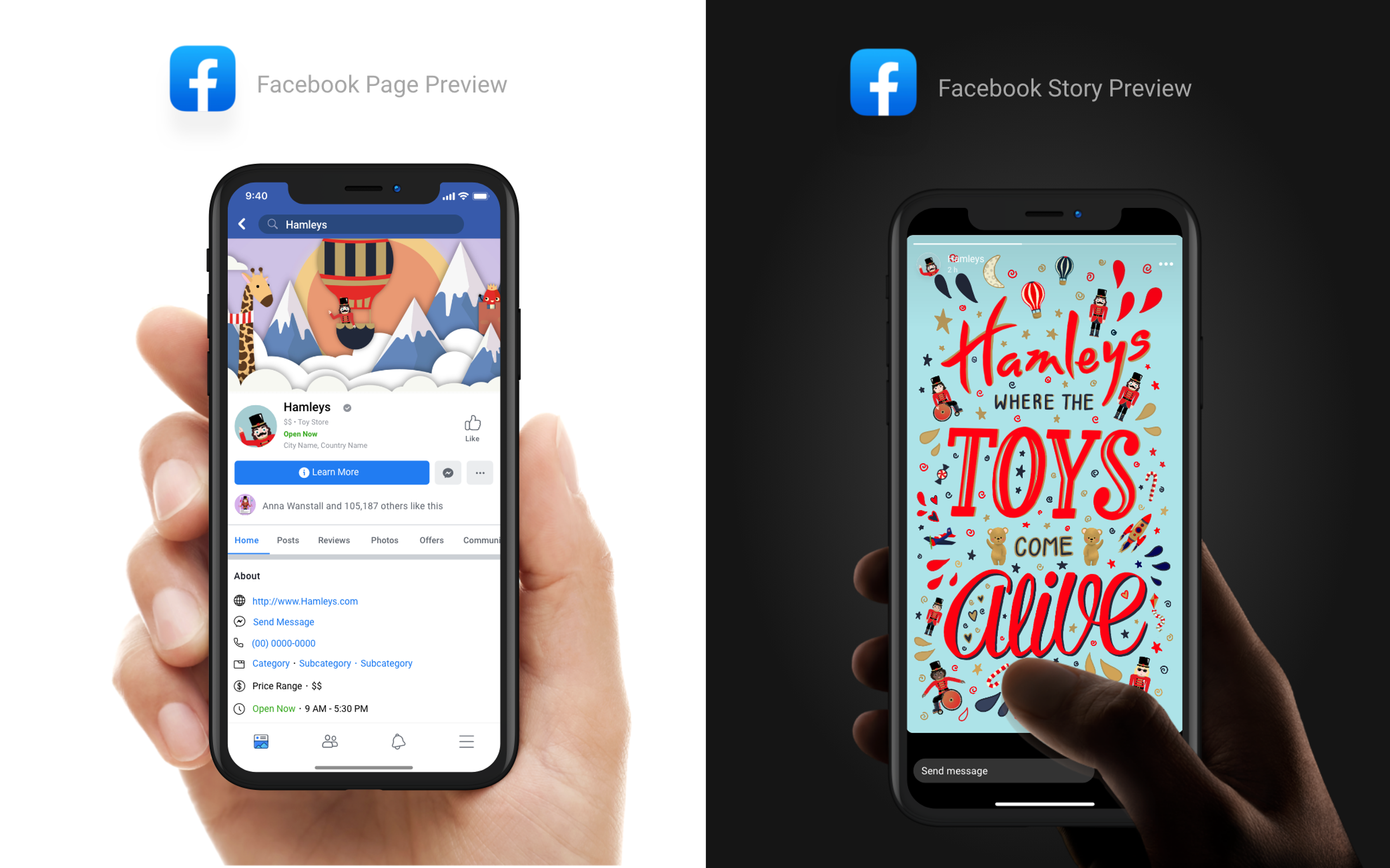
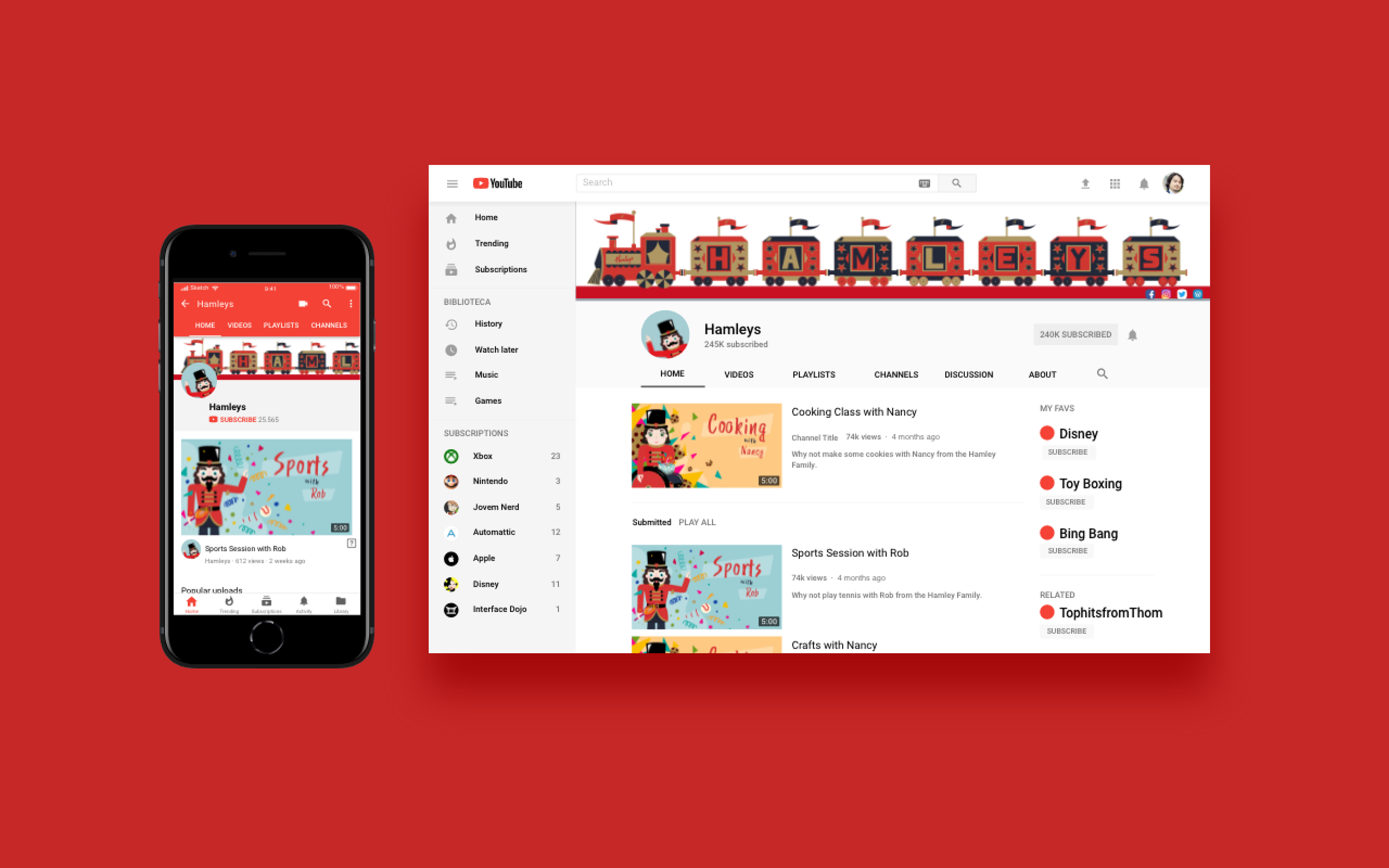
Social Media
Packaging


Website
Areas I was pleased with
I was particularly happy with the website landing page, also the overall concept of a family where children could relate to themselves in that family. I liked the inclusive depiction of the disabled children. Most of all I was pleased with the feedback on the project (A first from the university and praise from Hamleys social media team.)
Areas I would like to develop
I would’ve liked to add more pages to the website and I would also have liked to add more animation to the characters.
Thank You for Looking